In this digital era, one of the most popular company symbols that you see many times in a day is without any doubt, the Apple logo. In fact, the story behind the evolution of the logo is as much interesting as the story behind most of Apple products.
Whenever you take a look at a famous logo, you start wondering where did that idea come from and what is the inspiration behind it. In this article, we’ll take detailed look at the history and the story behind the Apple Logo and its evolution.
In this article
The Evolution of Apple Logo
During a press conference in 1981, journalists questioned Steve Jobs about why he chose the name Apple. Jobs replied back saying he likes apples. But Steve Jobs spent the rest of life in dedicating all his time and energy to ensure the company’s success.
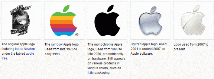
Over the years, the Apple logo has undergone only two major changes, but some color corrections also took place. The major transition was from the initial transformation of Ronald Wayne’s logo to the Rob Janoff’s version.
1976 – Apple’s First Logo
The first ever logo for Apple was designed by Ronald Wayne in 1976. Even though the design revealed the image of Newton and his apple, it was a complicated design.
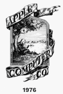
In simple words, the design was far from ideal to be called a logo in branding terms. But still this logo was the first ever logo created for Apple.
1977 – ‘98 – The Rainbow Version
The logo designed by Ronald Wayne was seen as an old-fashioned design and Steve Jobs wanted to change that. Hence, he asked Rob Janoff, a designer to come up with a brand-new logo that showcased the philosophy of the company.
Janoff came up with a rainbow-colored apple design with a bite. He even came up with a nice tag to the logo “Byte into an Apple”.
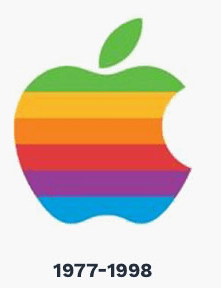
After several years, Janoff explained that he chose the rainbow color is due to the colored monitors. Even though it was not a big issue now, back in 1977, colored monitors were hugely popular over the monochromatic versions.
When Janoff was questioned about the bite in the apple, he simply replied the bite was to distinguish it from many other fruits like a cherry tomato. But his design of an apple with a bite unknowingly coincided with “byte”, the smallest unit of digital information.
The logo not only the apple image with a bite, but also had the company name “apple” written alongside. The logo was designed using a bold and modern sans-serif font.
1998 – The Translucent Version
When Steve Jobs joined the company back in 1997 after a gap of 12 years, he started to rebrand the whole company and concept. It included the logo redesign, new packaging for the products and translucent iMac etc.
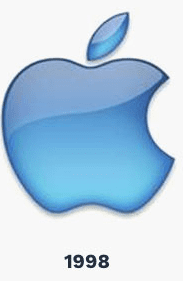
Among all these changes the logo redesign was the most significant change as he changed the rainbow design into a more translucent version. This change was necessitated because of the launch of the new Bondi blue iMac version. After 22 years, the rainbow version was changed into an all-new translucent version to synchronize with the iMac computer.
The Monochrome Version (1998 – 2000)
In 1998, the logo was again changed into monochrome flat version in full black. The logo represented how Apple underwent major financial difficulties and almost went close to bankruptcy and survived. But it managed to come out that precarious situation thick and thin.
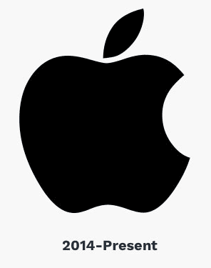
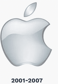
The Aqua Version (2001 – 2007)
From 2001 till 2007, Apple used an aqua version with a metallic look and the logo was slightly embossed. This glass themed or aqua version is the logo used for all apple products from 2001 till the end of 2007.
The Chrome Version (2007 till Now)
The version that is in use from 2007 till now is the Chrome version that showcases the company’s affinity towards technology and the brand simplicity. The present logo is extremely simple and sophisticated and widely accepted by everyone. It is also one of the powerful tools that carries together the company’s vision to the people.
Summary
Not many companies across the world enjoy the popularity and enthusiastic fanbase as Apple does. Today Apple is one of the most popular company in the world and the apple logo is one of the most widely recognized logos.
Similar for Nike, FedEx and McDonald’s, the apple logo is also very popular and can be quickly recognized by any one, no matter he owns an apple product or not.
The design of its logo can be largely attributed to its phenomenal success of its various products. Nowadays, people don’t give a second thought and just buy the product if there is an Apple logo in it. The Apple logo is the symbol of simplicity, innovation and trust.
Hope the details provided above has enriched your knowledge about the history and evolution of the Apple logo. Please post your comments and suggestions in the feedback section provided below.
