Image grids are crucial, with many people looking to have the best. Are you looking for high-quality CSS image grids to use? If yes, this piece is the best area to consult. Why? Because it highlights all the top CSS mage grids codes to use. It explains all the examples highlighting why one option is the best. Check out the list below to understand CSS Image grid codes.
In this article
- 1. Two by 2 Image Grid
- 2. Flexbox+ Quantity Queries Image Grid
- 3. Simple Pulsing Image Hover Effect
- 4. Pure CSS Thumbnail Hover Effect
- 5. Hexagon Grid
- 6. Isometric Image Grid
- 7. CSS Image Grid
- 8. CSS Image Grid with Hover
- 9. Image Mosaic Effect with CSS Grids & Blend
- 10. When Life Gives You Lemons
- 11. Image hover effect
- 12. Flexbox project 5: image grid
- 13. Image Grid Responsive- CSS Grid
- 14. Simple and Responsive CSS Image Grid
- 15. CSS Grid Responsive Image Gallery
- 16. Rotated Image Grid
1. Two by 2 Image Grid
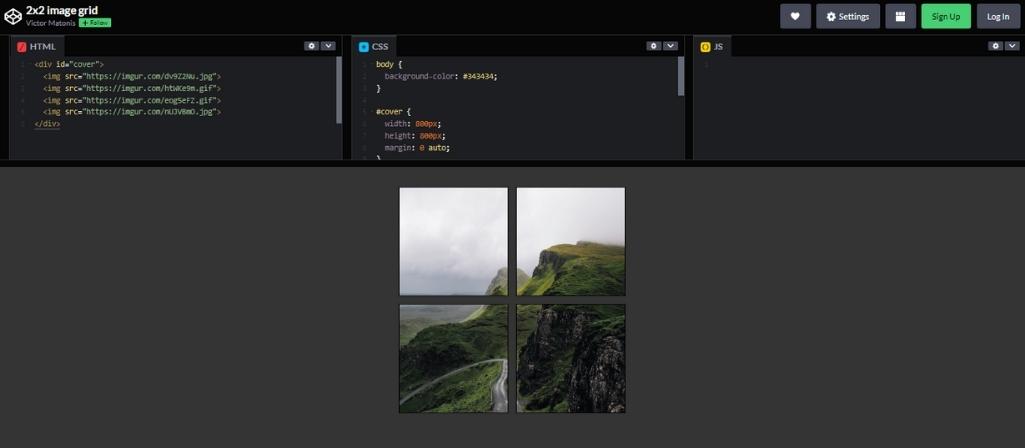
This CSS image grid is the top choice in our list. It is a simple code by codepen user Victor Matonis and uses HTML and CSS. As the name recommends, it is a grid that delivers four images simultaneously. The non-response image grid example is flexible and compatible with many browsers, including Chrome, Edge, Opera, Firefox, and Safari.
2. Flexbox+ Quantity Queries Image Grid
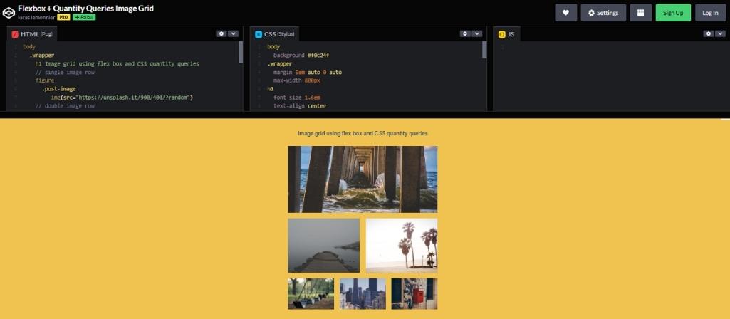
Lucas Lemonnier is the codepen user behind this CSS image grid code. The code uses HTML and CSS; you can edit it on codepen. The grids use flex boxes, and it’s responsive. Besides, it’s compatible with many browsers. Try out this CSS image grid for a great experience.
3. Simple Pulsing Image Hover Effect
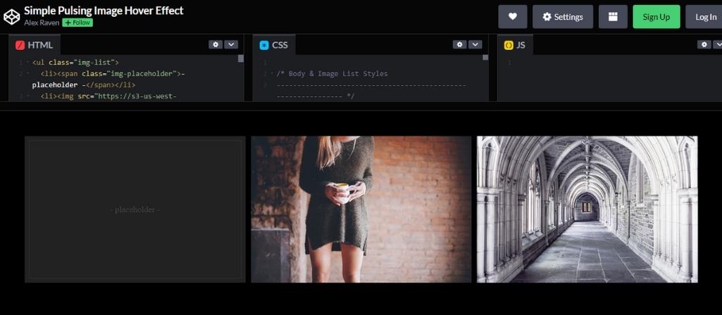
Are you looking for something interesting to include in your photos? If yes, then this CSS image grid code is a great choice. After all, it’s a responsive image grid that delivers a unique effect allowing you to pay maximum attention to the images. The code is by Alex Raven using HTML and CSS.
4. Pure CSS Thumbnail Hover Effect
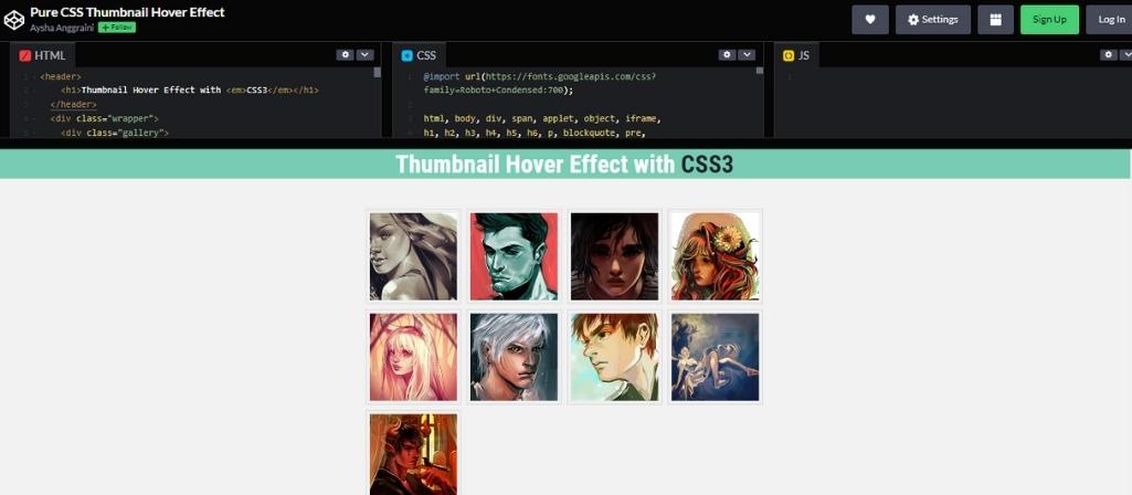
This CSS image grid code example highlights multiple images at the same time. Whenever you need to view the details, all you have to do is click on it. As a result, you can easily place all the essential images together and slowly analyze them.
5. Hexagon Grid
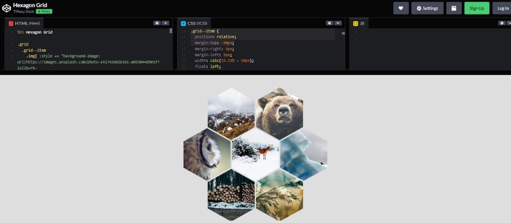
Get a high-quality and elegant CSS Image grid in codepen. As the name suggests, it features a hexagon design allowing the image to fit into the shape. The code is by codepen user Tiffany Stolk and uses HTML and CSS.
6. Isometric Image Grid
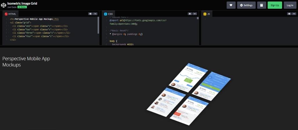
Joel Eade is the codepen user behind this CSS image grid code example that uses HTML and CSS. The non-responsive image grid is compatible with multiple browsers, including Chrome, Edge, Safari, Opera, and Firefox.
7. CSS Image Grid
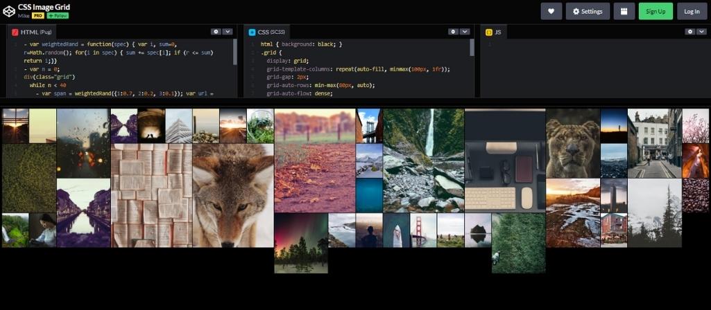
As the name suggests, this CSS image grid is a simple grid you can use to highlight pictures. It is a content style where you can contain multiple images. Besides, the image grid makes the images more accessible simultaneously. This code’s writer is a codepen user, Mike using HTML and CSS.
8. CSS Image Grid with Hover
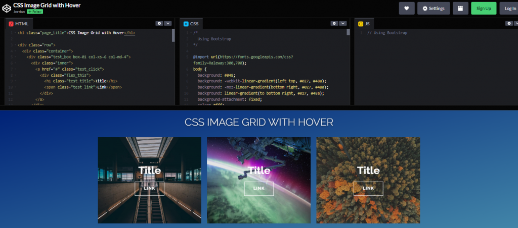
Get this CSS image grid code example that will capture the attention of many. After all, the image grid highlights multiple images together and includes responsive effects. That is, pointing to an image will highlight it. The CSS image grid uses HTML and CSS, and it’s by codepen user Jordan.
9. Image Mosaic Effect with CSS Grids & Blend
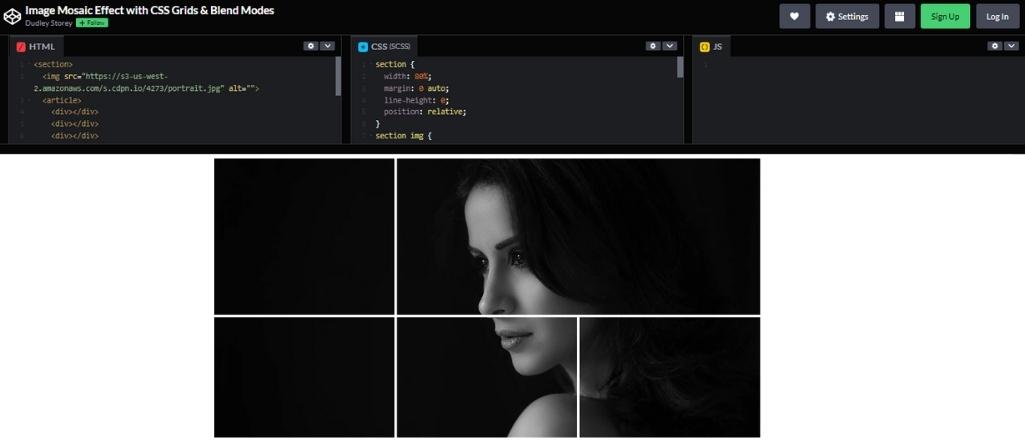
Do you wish to include a unique grid effect on your image? If yes, this CSS image grid cope example is an ideal option. It is an excellent choice whenever you wish to edit one photo into something interesting. The grid concept helps you highlight essential features allowing all your advantages to stand out from others. Besides, the code is by codepen user Dudley Storey using HTML and CSS. Try it out today for a pleasant experience.
10. When Life Gives You Lemons
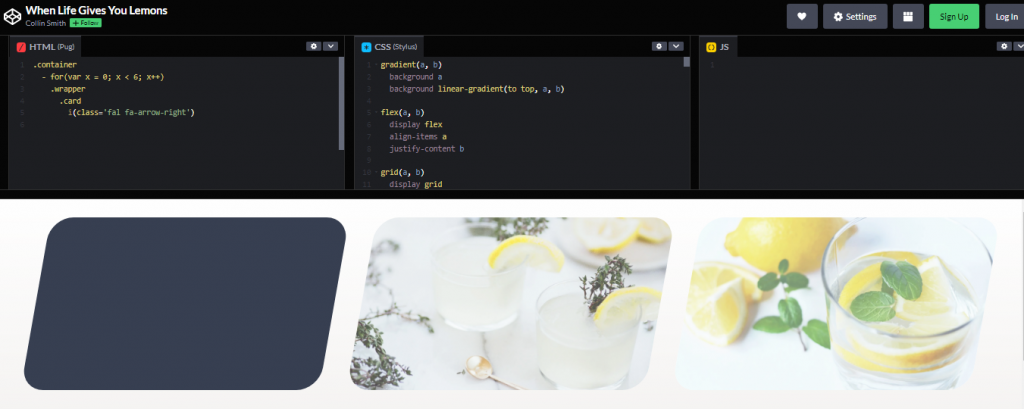
This CSS image grid code is by codepen user Collin Smith using HTML and CSS. It features a faint colour highlight on the many images. However, the colour and art are clear upon clicking on the images. This CSS image grid allows you to place your images together and correctly recognize a specific image. Besides, you can get this image grid code from codepen and make the necessary changes on the platform.
11. Image hover effect
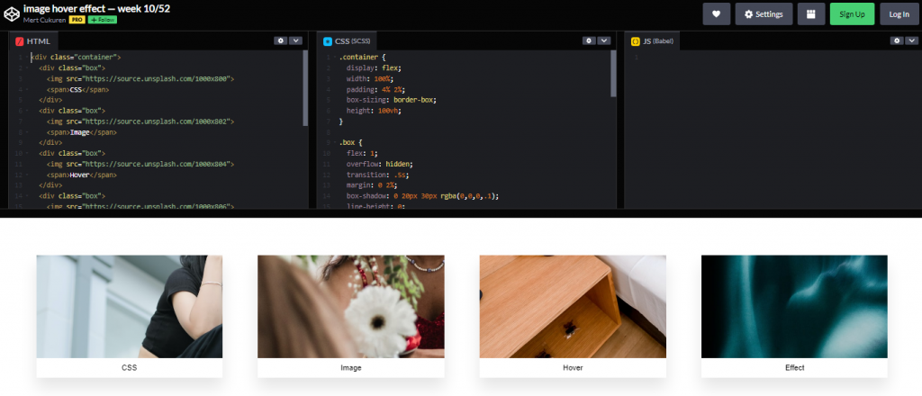
Mert Cukuren, a pro codepen user, is the writer of this CSS image grid code using HTML and CSS. It is a simple but powerful CSS image grid code. After all, the grid includes effects that allow you to expand an image upon clicking it. This code can contain multiple images and later expand them when necessary.
12. Flexbox project 5: image grid
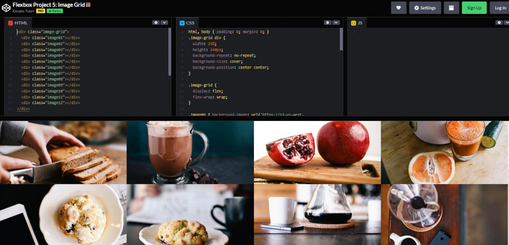
A code by a pro codepen user, Envato Tuts, presents all the necessary images in an organized way. This CSS image grid code uses HTML and CSS. Using this CSS image grid code, you can place relevant images together and pass any information. Get this CSS image grid code together and present multiple images but relevantly.
13. Image Grid Responsive- CSS Grid
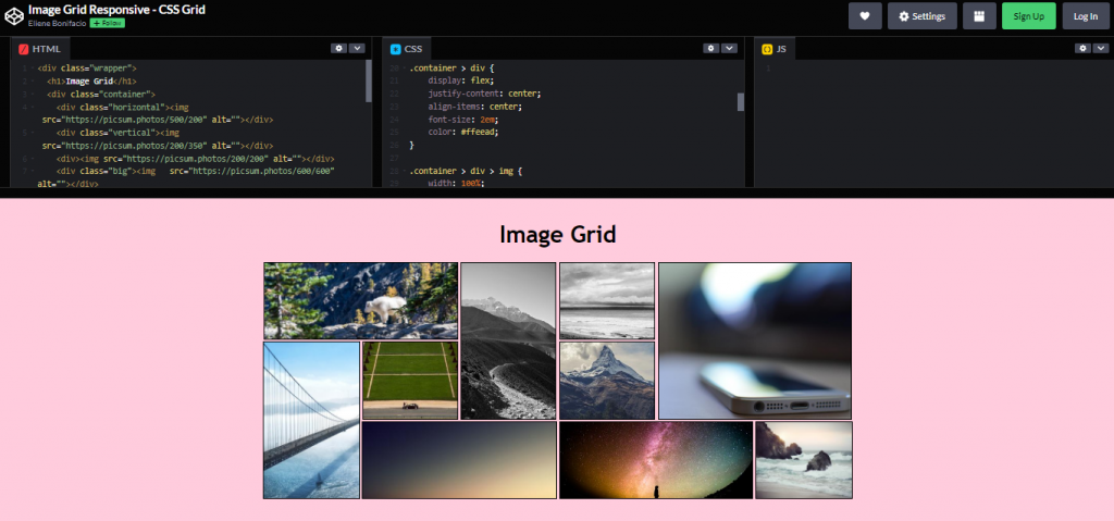
Are you looking for a CSS image grid that can house many images from different genres? If yes, this image grid code is the ultimate solution. After all, it places the images in different sizes but in an orderly manner. The code is by codepen user, Eliene Bonifacio using HTML and CSS.
14. Simple and Responsive CSS Image Grid
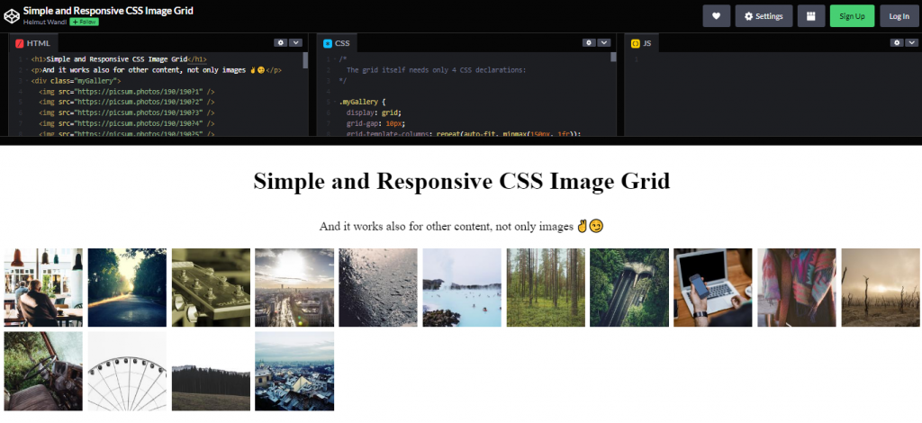
This CSS image grid code example is flexible; it works on images and other contents. Therefore, this CSS image grid is a great choice if you are looking for something solid to fit different purposes. The image grid is by Helmut Wandl and it uses HTML and CSS. Also, you can get the CSS image grid code in the codepen and make the necessary edits.
15. CSS Grid Responsive Image Gallery
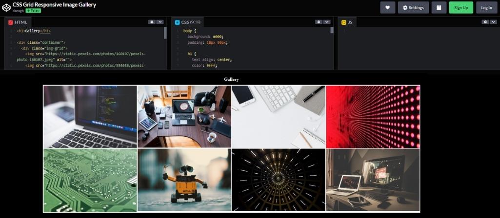
Do you wish to keep all your images together in an organized manner? If yes, try out this CSS grid image gallery from codepen. It is a code by codepen user Daragh using HTML and CSS. Besides, the responsive nature of the image grid allows you to concentrate on one image at a time.
16. Rotated Image Grid
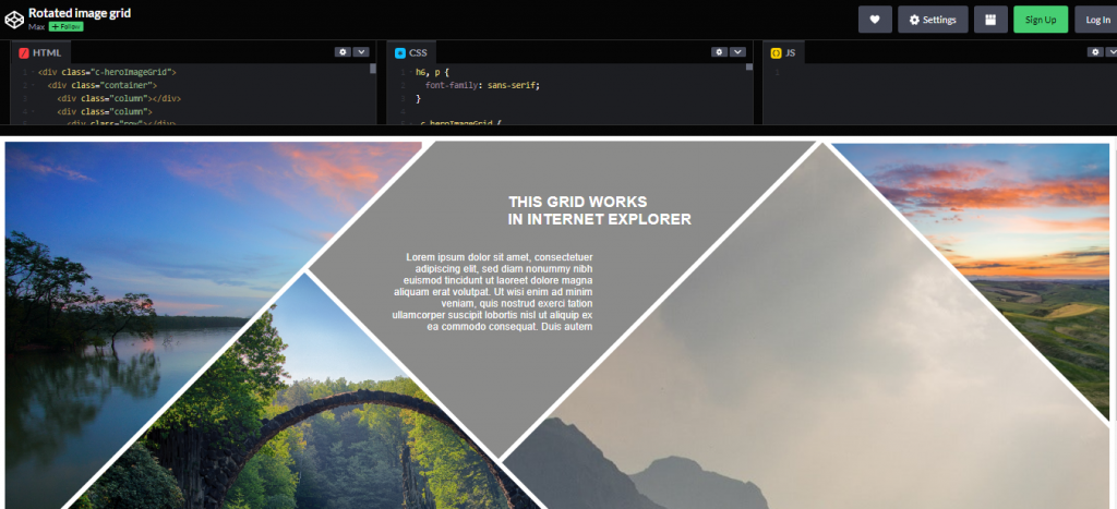
Last but not least, we have the rotated CSS image grid code. It is a code by codepen user Max using HTML and CSS. Unlike other grids, it features different shapes allowing you to view images at various angles. Also, the responsive ability lets you concentrate on one part simultaneously.
